This summer has presented itself as a bit of a challenge in so many ways – organising and managing Taunton Live and Pride Festival emerging from a pandemic and project-managing a variety of arts-based trails…
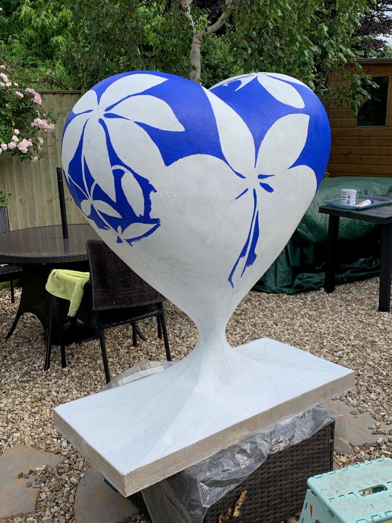
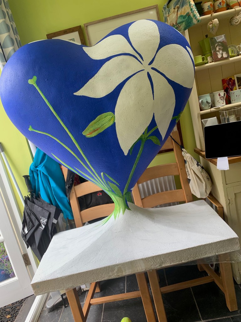
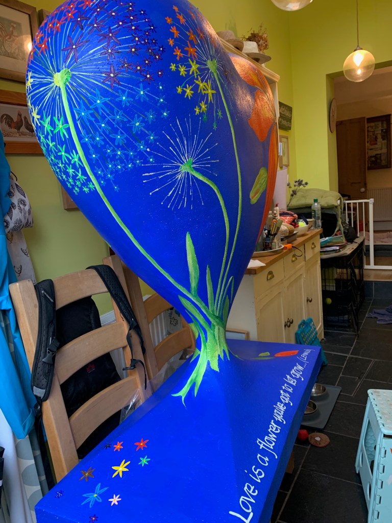
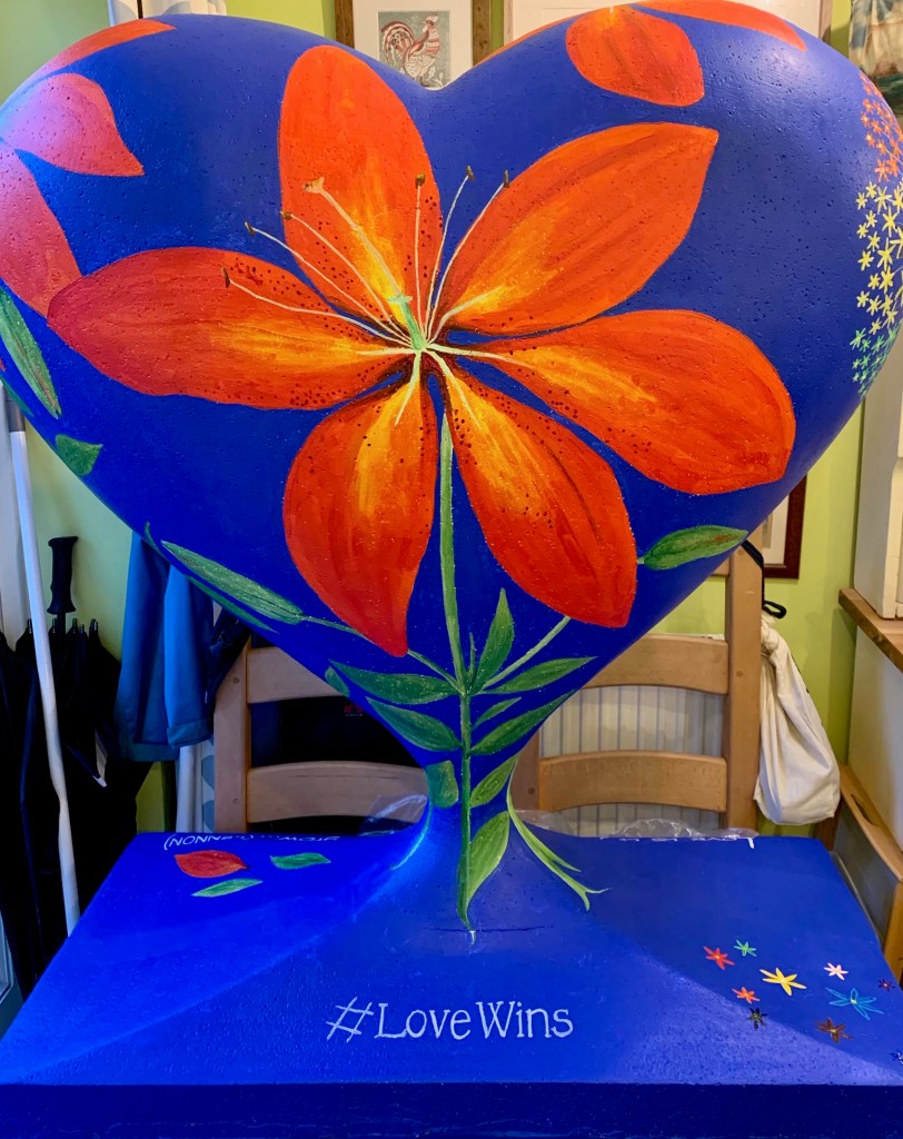
#LoveWINdowS Trail was one devised to inject interest in local businesses by decorating windows along the #Love Wins theme to also raise awareness for Pride month, signalling that Taunton is actually an accepting place to live and work…
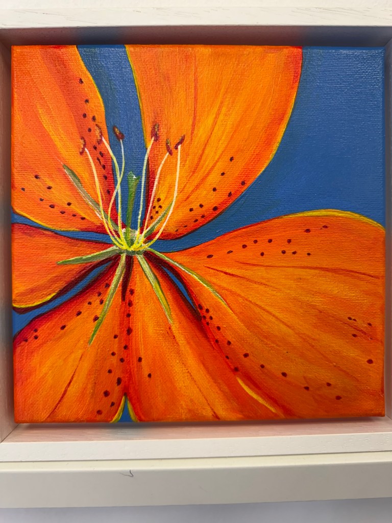
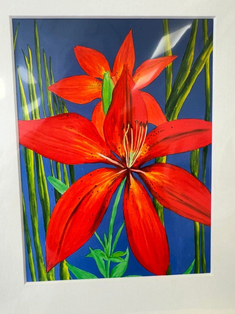
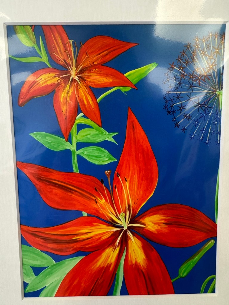
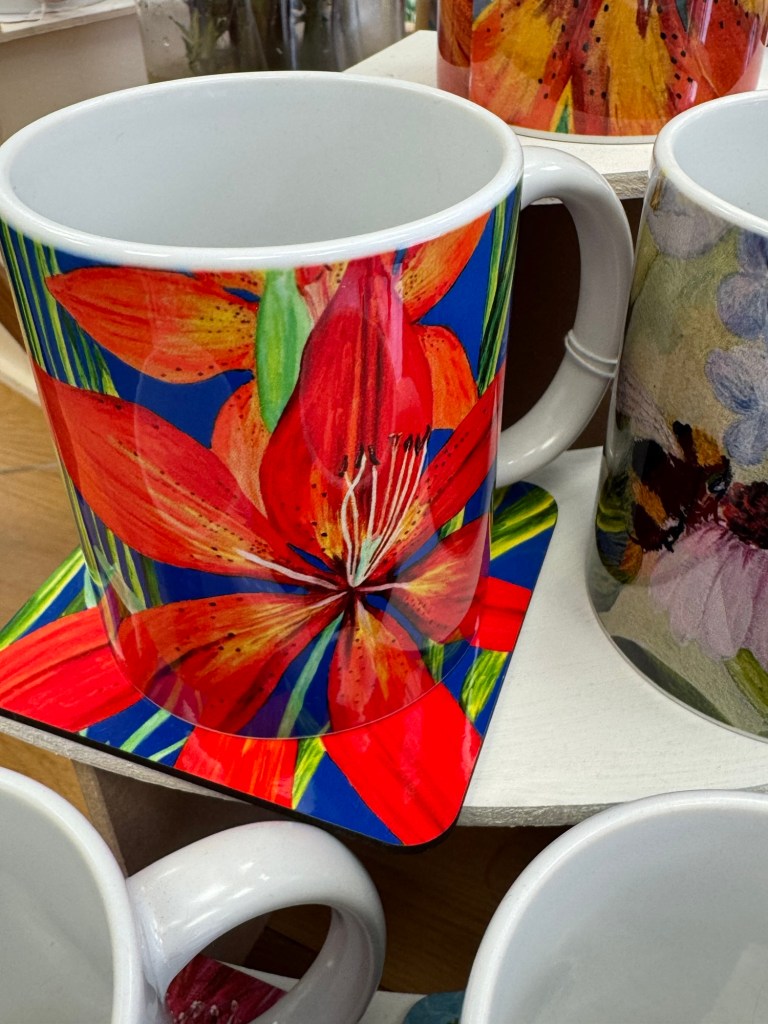
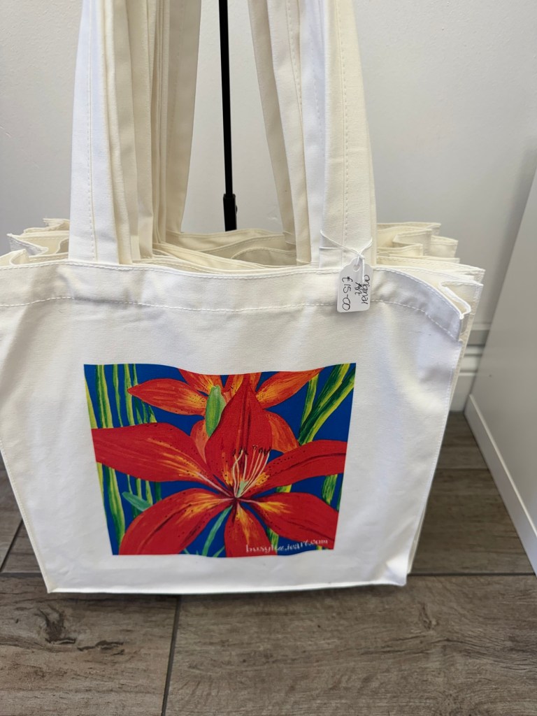
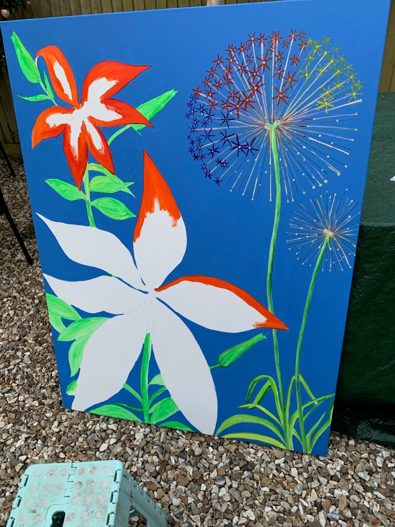
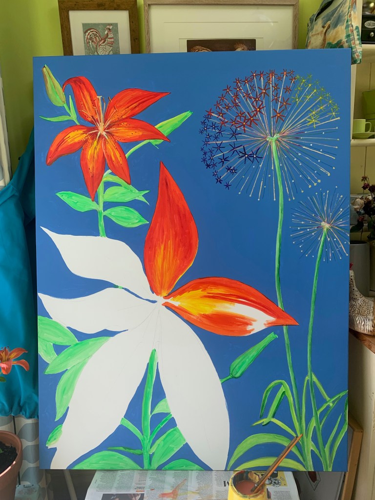
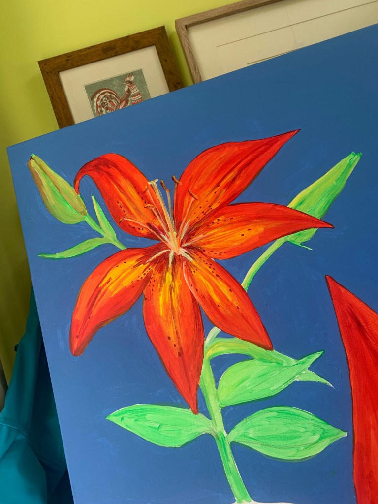
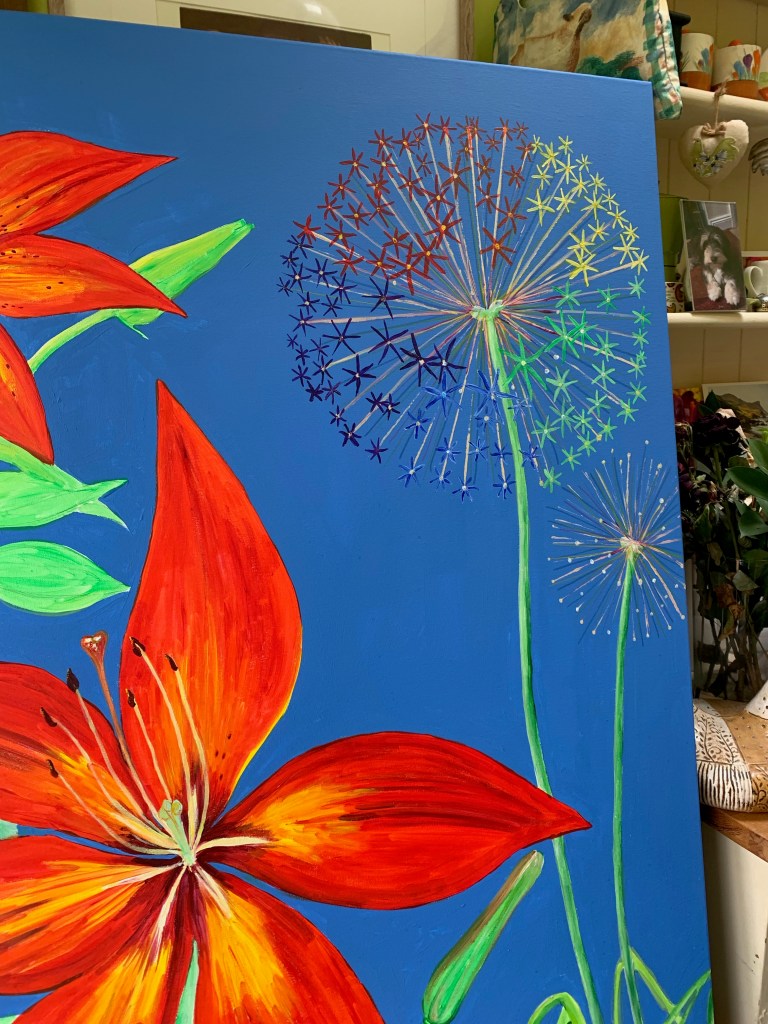
My contributions to this as an artist was to create a pair of large floral themed canvases for the local shopping Centre to fill an empty shop and as the garden was bursting with vivid colour, I decided they had to capture the glorious colour of the asiatic lilies…
Creating a pair of canvases was just the tonic to take me away from the Event management Plan rewrites and Risk Assessments required for the up-coming festival – a bit of relaxation playing with colour…
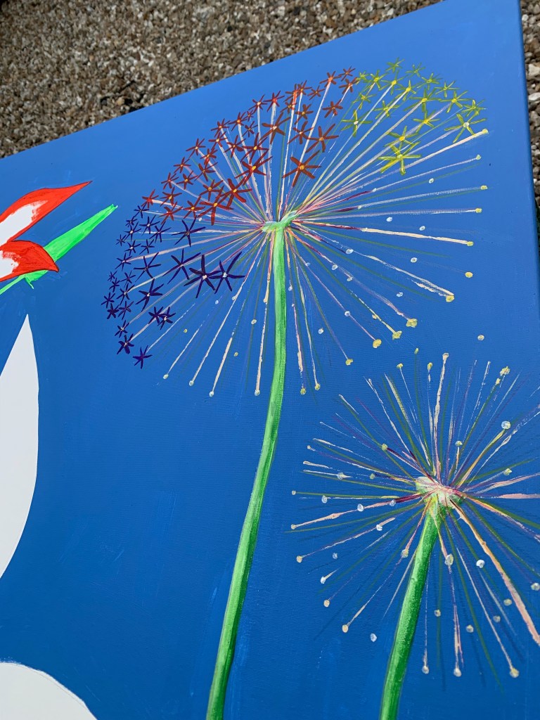
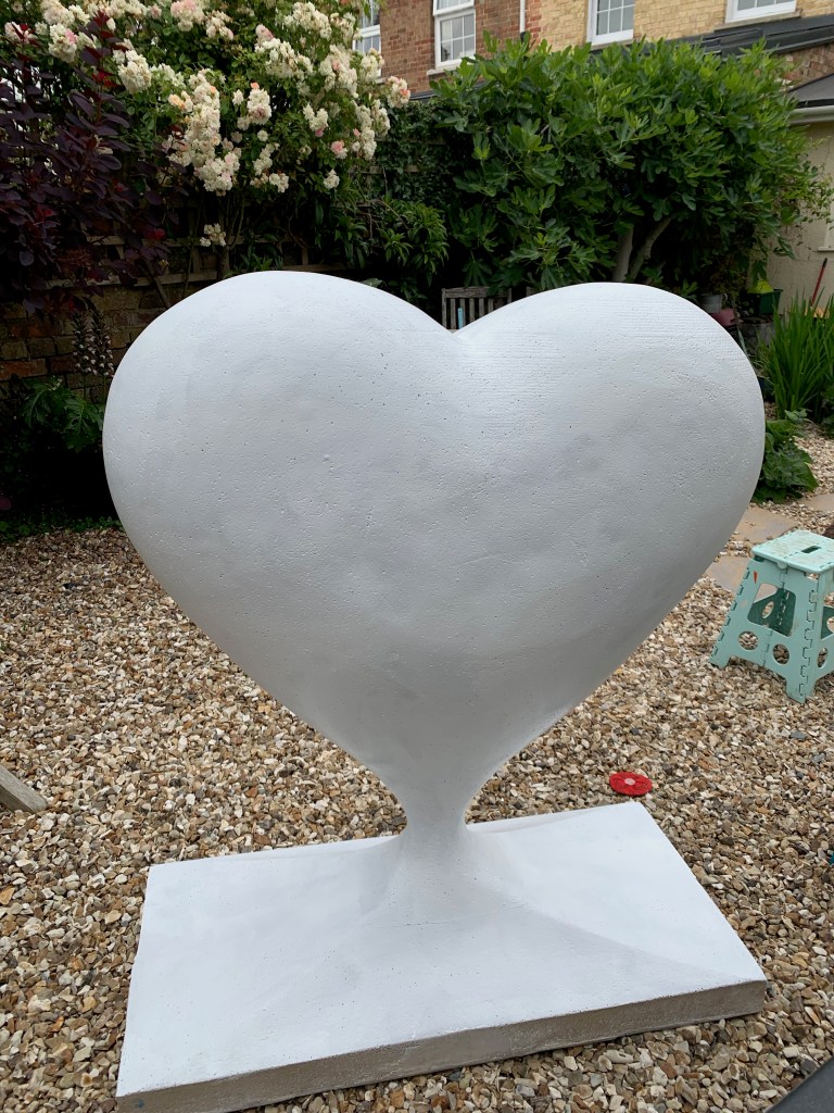
Being presented with a giant fibreglass heart to design and paint actually was a no-brainer – use the same idea, drape the lilies over the sumptuous curves fo the heart and add the rainbow allium to tie in with the theme…
A great achievement in limited time! #LoveWin; Colour wins every time!
Enabling young children, by teaching the skills to express themselves in spoken or written words or through drawing, painting or creating prints or 3D constructions and sculptures, is something that matters deeply to me. Over thirty-three years of primary teaching experience tells me that the teaching of these skills must not be neglected or squeezed out of the curriculum, and yet effective teaching in this area requires specific knowledge and this is sadly missing from many initial teacher training programmes or only present in scant measure….
Busylizzie Art offers training for teachers to teach the language and skills of art:
a complete and whole school service from the initial discussion through to planning for progression, INSET and side by side staff training (apprenticeship style) developing and furthering skills into full competence
whole-school art projects in the style of ‘Take One Picture’, or based on the locality of the school
work with groups in EYFS/whole classes of children from Y1 to Y6, to produce art work of quality
working along side children and/or adults to develop art skills apprenticeship style
work can be mounted and displayed in a ‘professional style’ exhibition for parents/community
all aligned to the National Curriculum 2014
Also available, ‘In Depth’ projects which combine the teaching of art skills alongside developing those reading skills of inference and deduction as well as ways to encourage children to add more detail to their writing….
All projects will be tailor-made to suit the experience of the children and the size of the school; they will build on existing skills and unleash the potential to create amazing works of art on a variety of scales….
Designs individually created for your living spaces, children’s bedrooms, new baby’s nurseries, child-care settings and then hand-painted directly onto walls or canvases…
Meet with Liz of Busylizzie Art to discuss your ideas and requirements; the choices are endless and could even be a favourite cuddly toy!
A design board will then be created for the selected idea showing colours and sample paintings…
Once the decisions have been made, the painting(s) can be completed directly onto the wall or canvases as preferred.
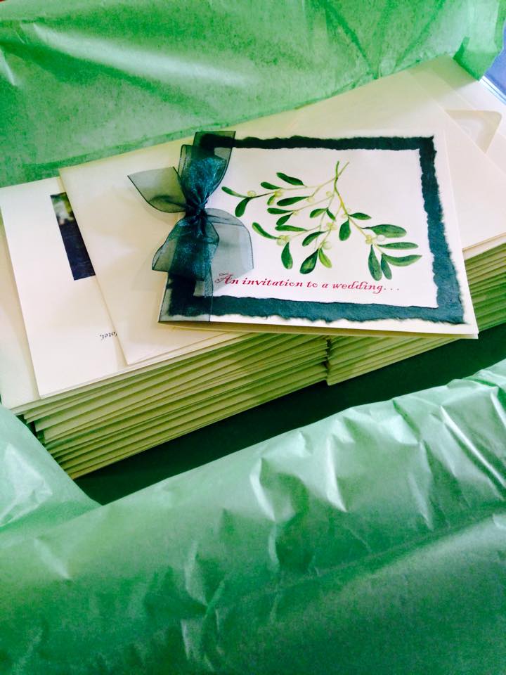
I offer a full range of handmade stationery including save the date cards, invitations, place name cards, seating plans, menus and much more, all designed and created for your special day from original watercolour paintings…
Start by choosing your flowers or theme
meet with Liz of Busylizzie Art to discuss your ideas and requirements
select from a range of ‘prototype’ paintings for your final design
Choose your preferred card and add a range of applique – ribbons, beads, torn paper, lace
Hand packaged and delivered personally along with framed artwork presented to the bride and groom.
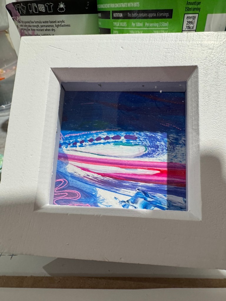
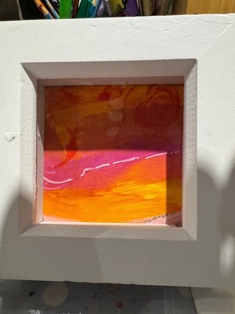
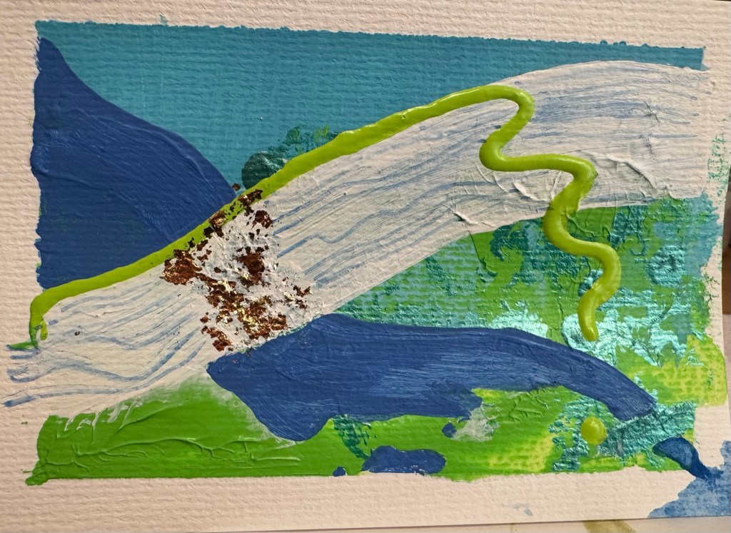
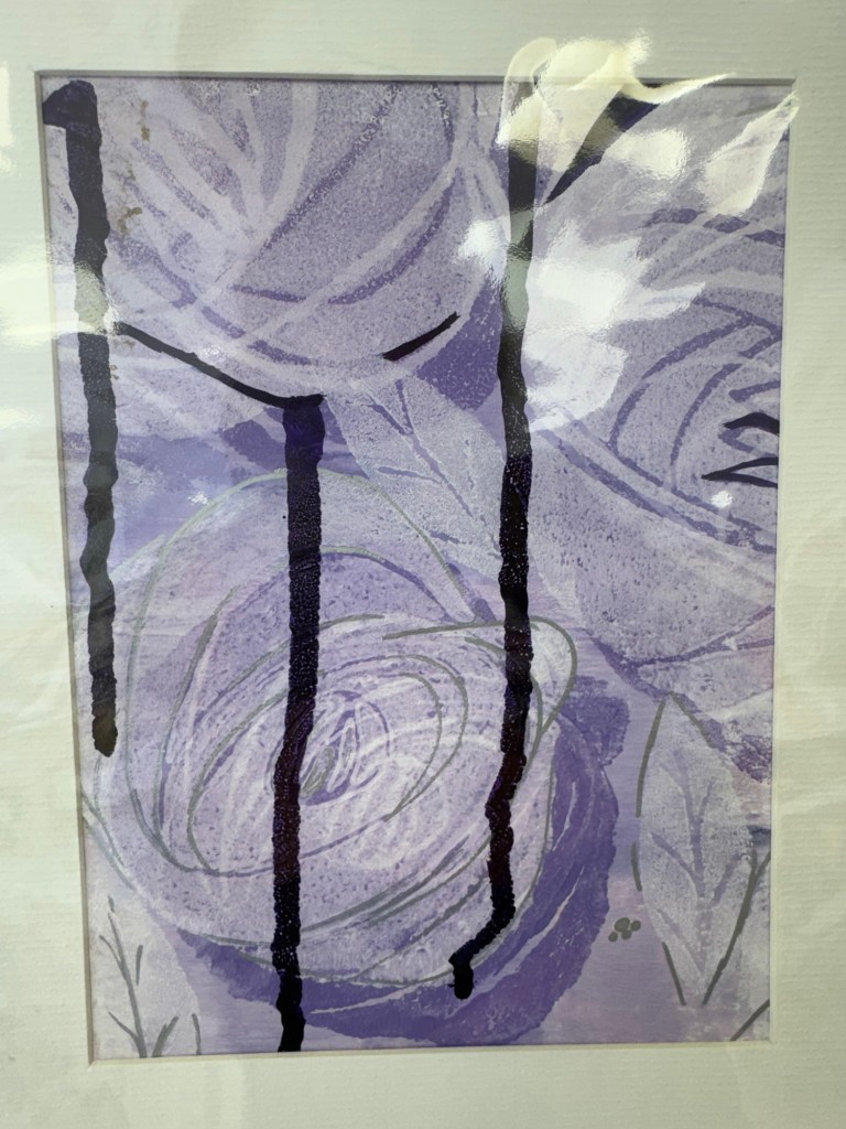
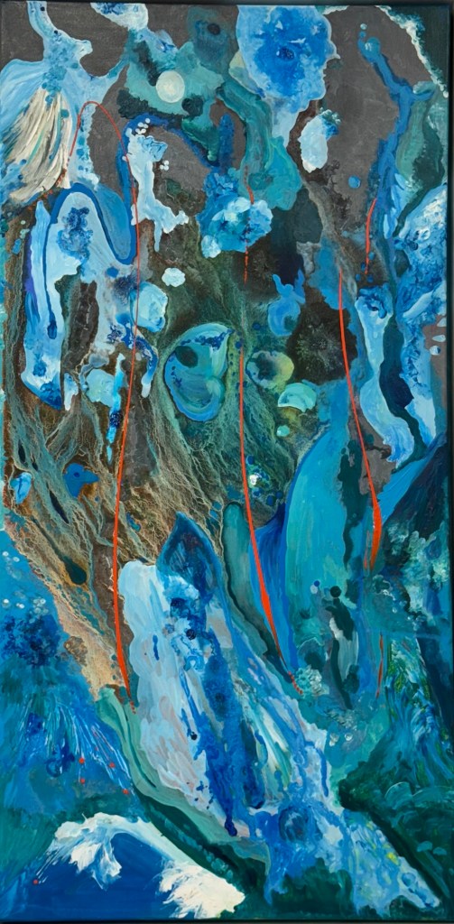
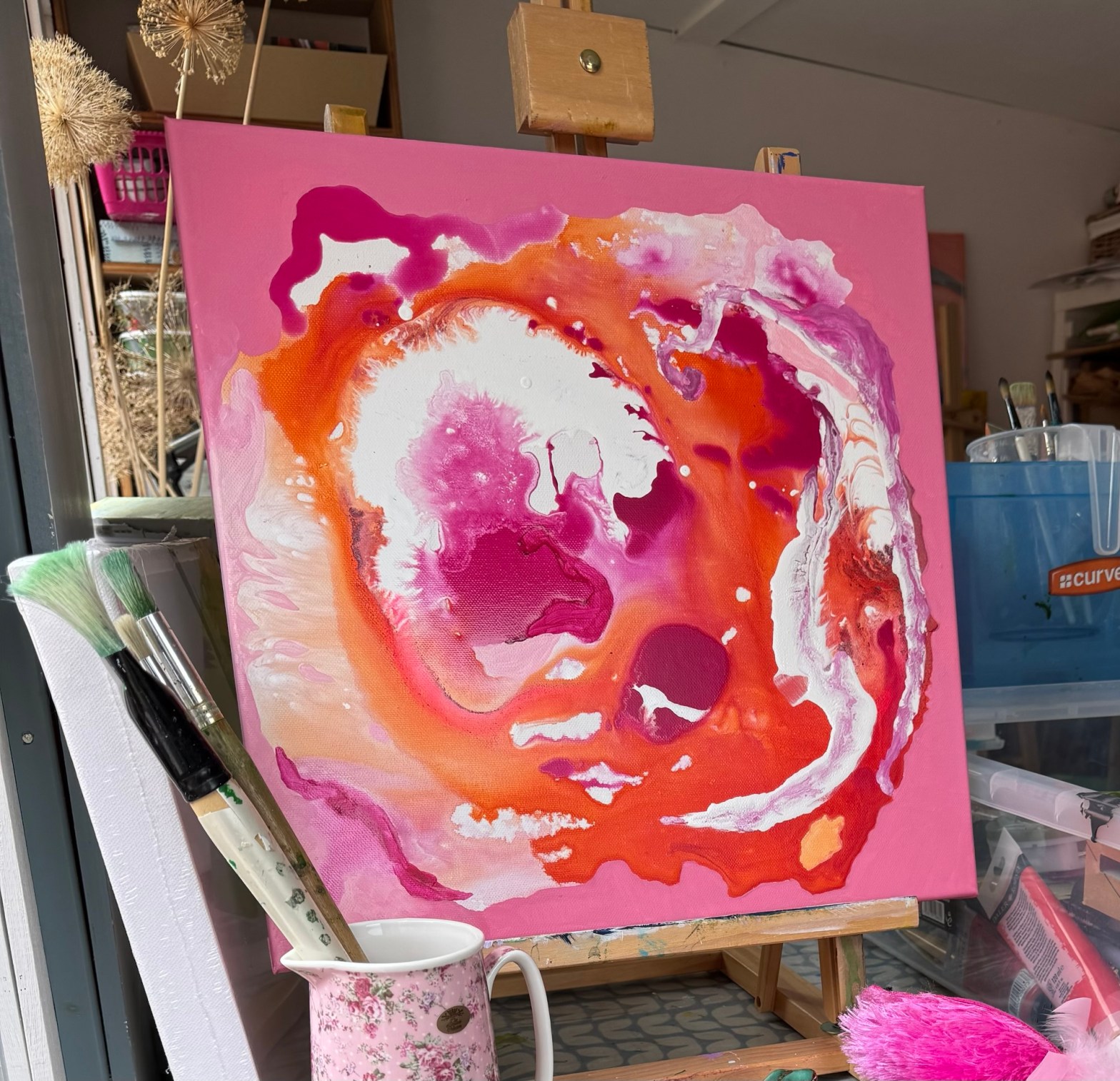
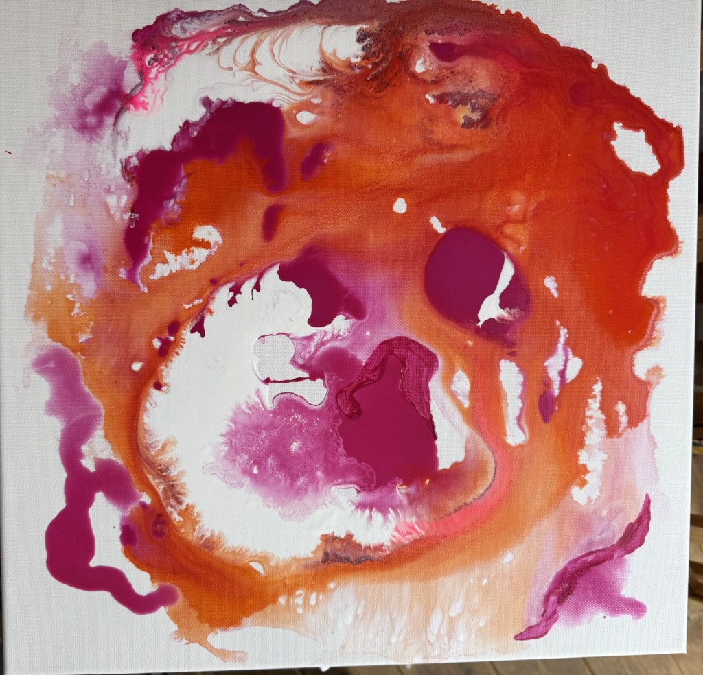
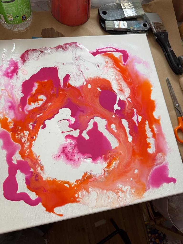
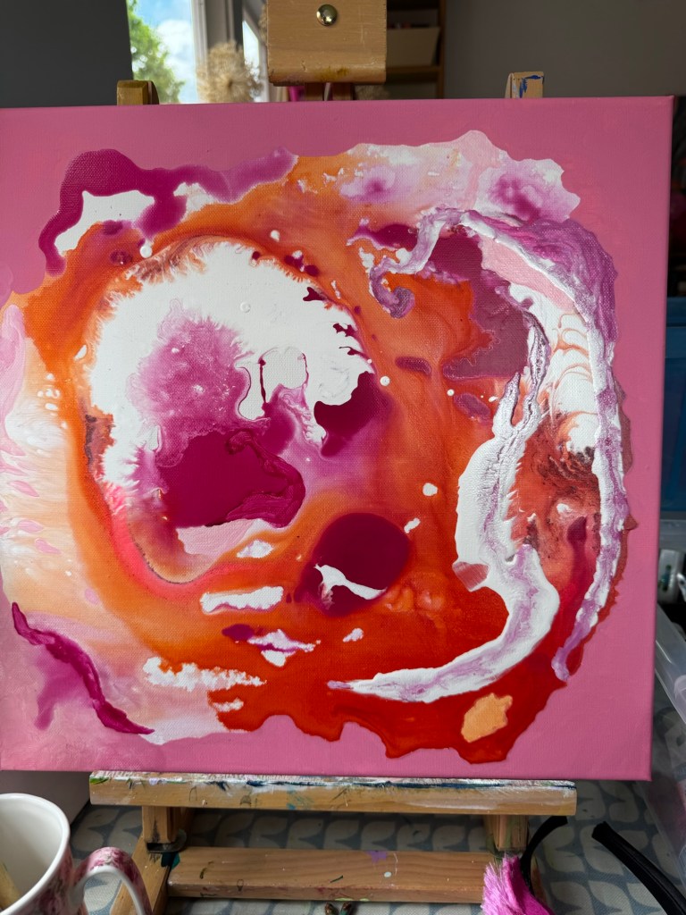
…this is how it began – a wet canvas with some bright fuschia pink and orange paint…rolling, tilting, encouraging it to move around the canvas and ‘find’ its shape…
…then came the acrylic ink and white paint plus pouring medium to create some space…
…finally a brush and flat, matt pink to hold it all in and encompass the energy of the centre…
Not sure if it’s complete yet, but its frame is ordered in readiness!
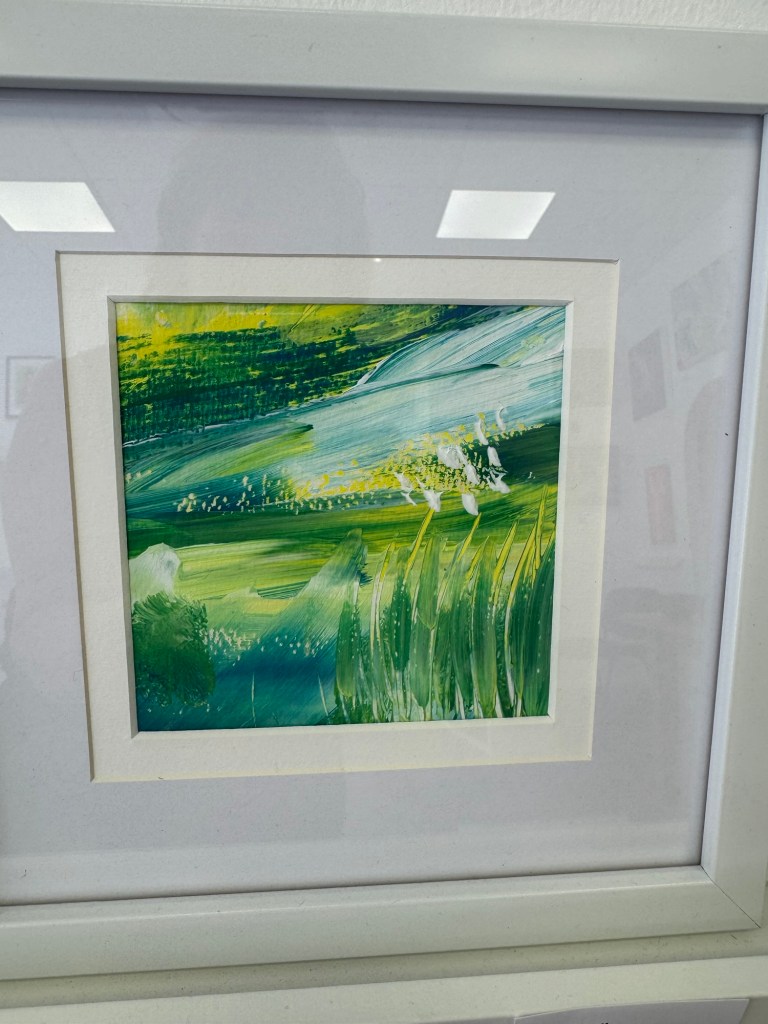
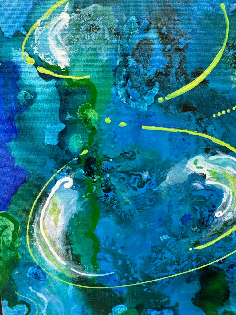
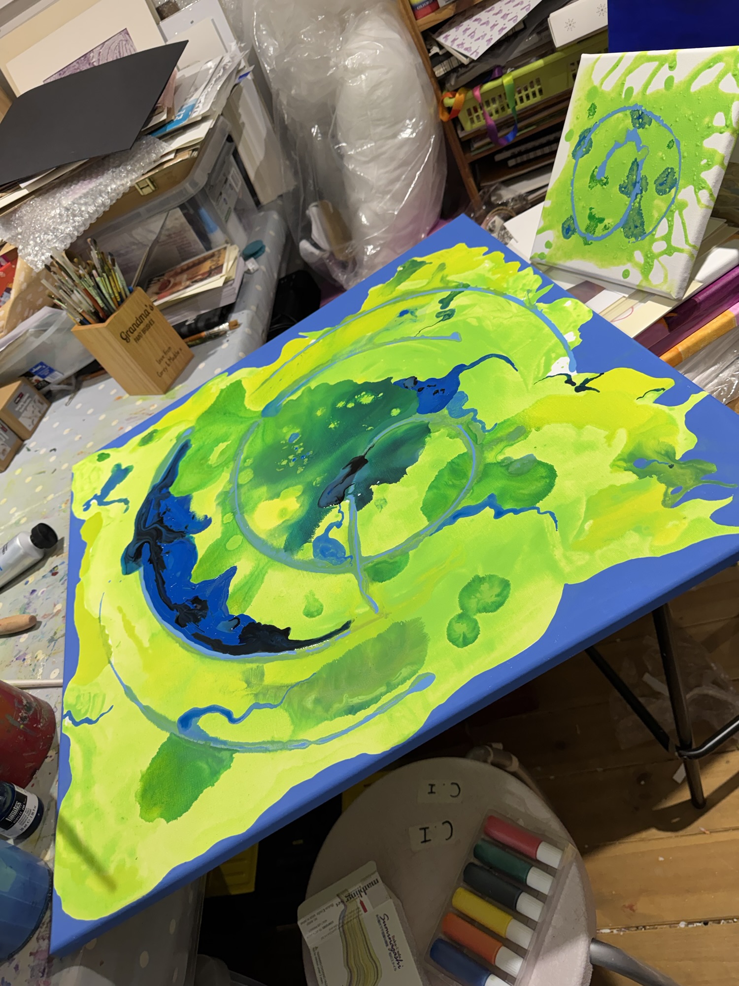
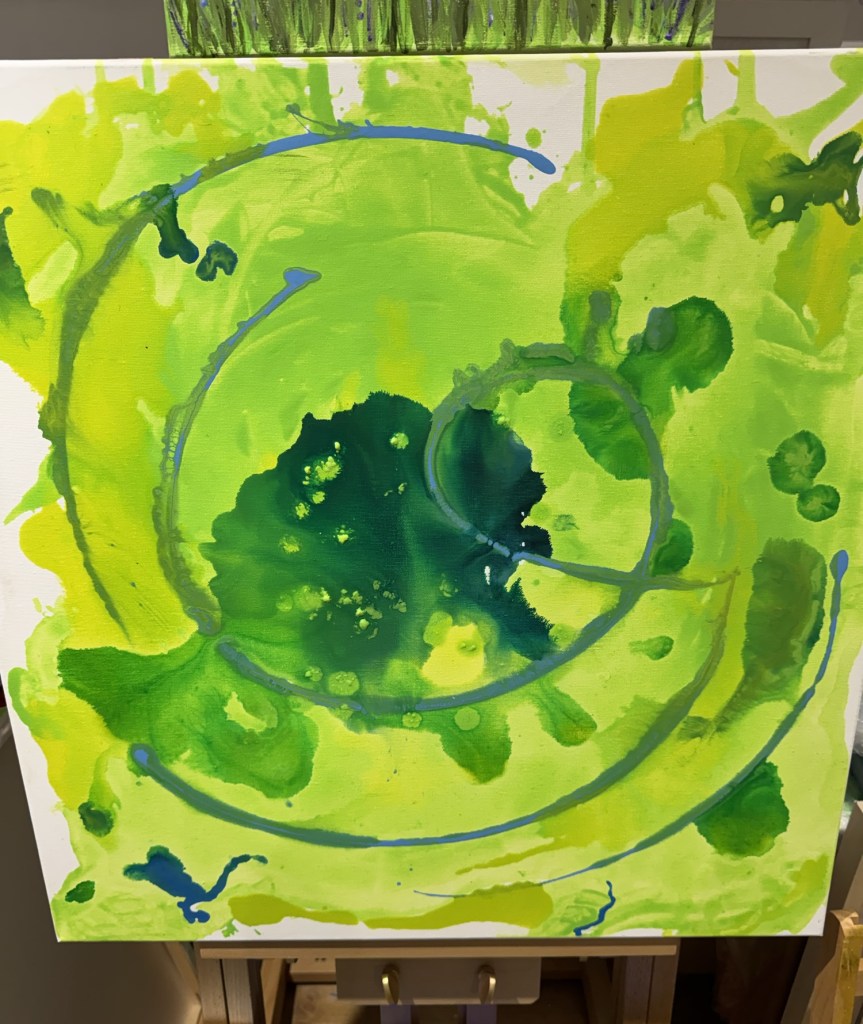
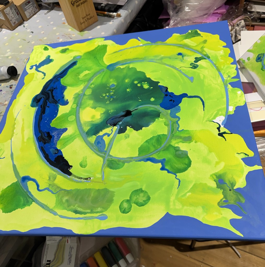
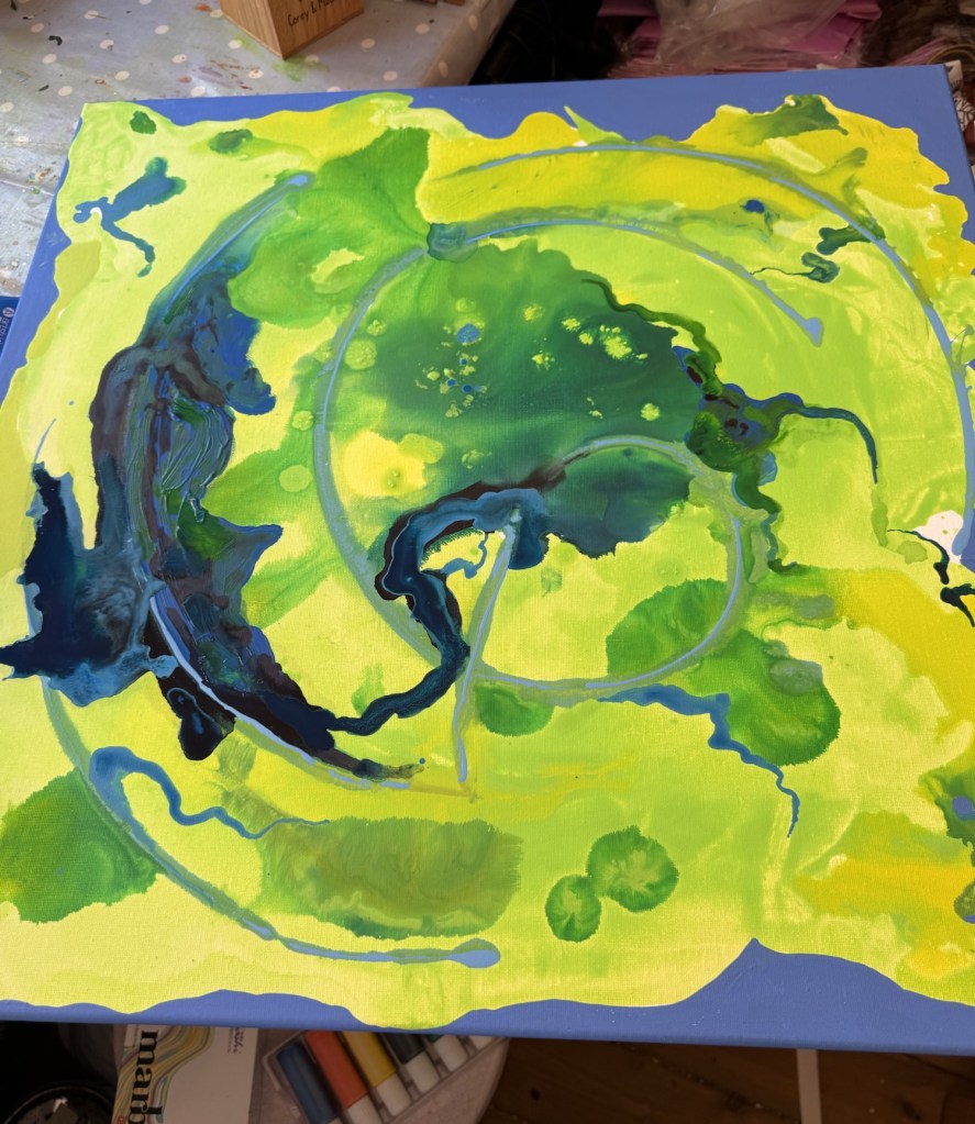
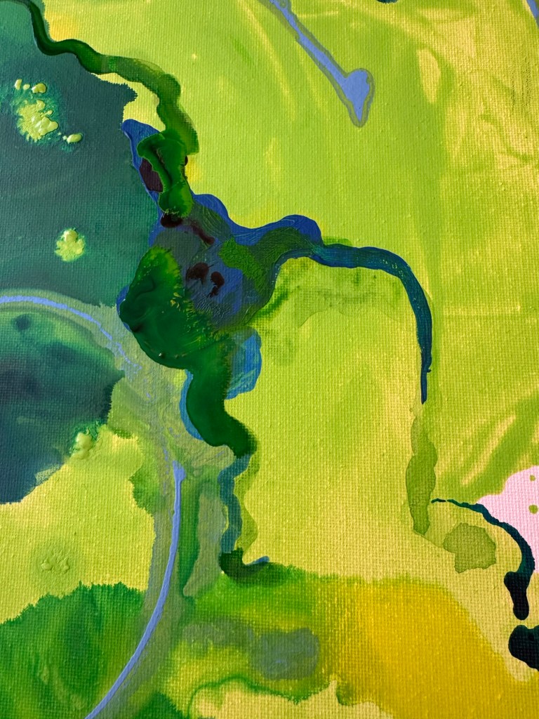
Choosing the green of a spring morning dancing, the green of newly unfurled hydrangea leaves…adding a touch more yellow then combining with pouring medium, stirring carefully to squash the lumps of pigment…taking the largest available canvas in the studio, adding water to its surface, then watching the beautiful colour find its way as I pour gently onto the surface, slowly.
As the spring green settles, I choose a bright turquoise ink and allow drops to fall onto wet areas, finding its own route…then add an emerald green and yellow, allowing each colour to spread at its will…
Slow beginning…
…and then the control breaks through this starting tranquility – rings of pale blue, squeezed from a fine- nozzles bottle, circle the canvas, holding the inks, stopping their progress creating intense areas…
…regaining control…
The blue of Pra Loup skies defines the edge of the creation…and so it continues, choosing colours deliberately but moving between control and allowing the natural ‘evolution’ of this spring inspired piece…
where did that deep blue come from???…not sure where it’s going right now…
It will find its course, and eventually feel complete…check back in a week or so to see how it ends up!
Welcome to WordPress! This is a sample post. Edit or delete it to take the first step in your blogging journey. To add more content here, click the small plus icon at the top left corner. There, you will find an existing selection of WordPress blocks and patterns, something to suit your every need for content creation. And don’t forget to check out the List View: click the icon a few spots to the right of the plus icon and you’ll get a tidy, easy-to-view list of the blocks and patterns in your post.
Welcome to WordPress! This is a sample post. Edit or delete it to take the first step in your blogging journey. To add more content here, click the small plus icon at the top left corner. There, you will find an existing selection of WordPress blocks and patterns, something to suit your every need for content creation. And don’t forget to check out the List View: click the icon a few spots to the right of the plus icon and you’ll get a tidy, easy-to-view list of the blocks and patterns in your post.
Welcome to WordPress! This is a sample post. Edit or delete it to take the first step in your blogging journey. To add more content here, click the small plus icon at the top left corner. There, you will find an existing selection of WordPress blocks and patterns, something to suit your every need for content creation. And don’t forget to check out the List View: click the icon a few spots to the right of the plus icon and you’ll get a tidy, easy-to-view list of the blocks and patterns in your post.
Welcome to WordPress! This is a sample post. Edit or delete it to take the first step in your blogging journey. To add more content here, click the small plus icon at the top left corner. There, you will find an existing selection of WordPress blocks and patterns, something to suit your every need for content creation. And don’t forget to check out the List View: click the icon a few spots to the right of the plus icon and you’ll get a tidy, easy-to-view list of the blocks and patterns in your post.
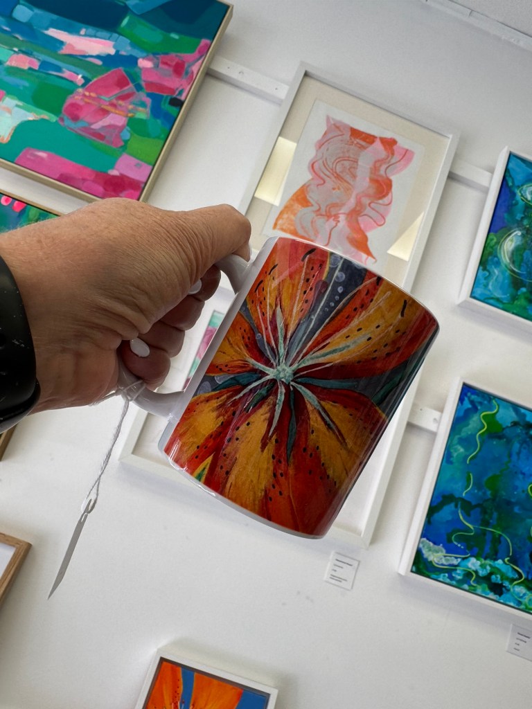
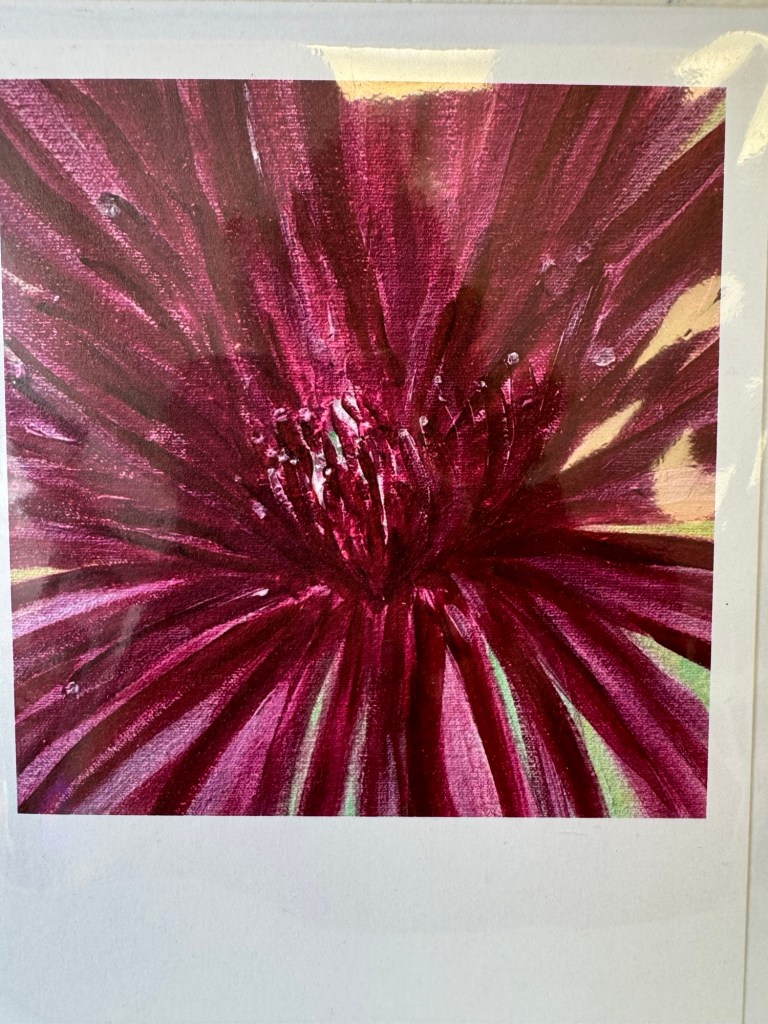
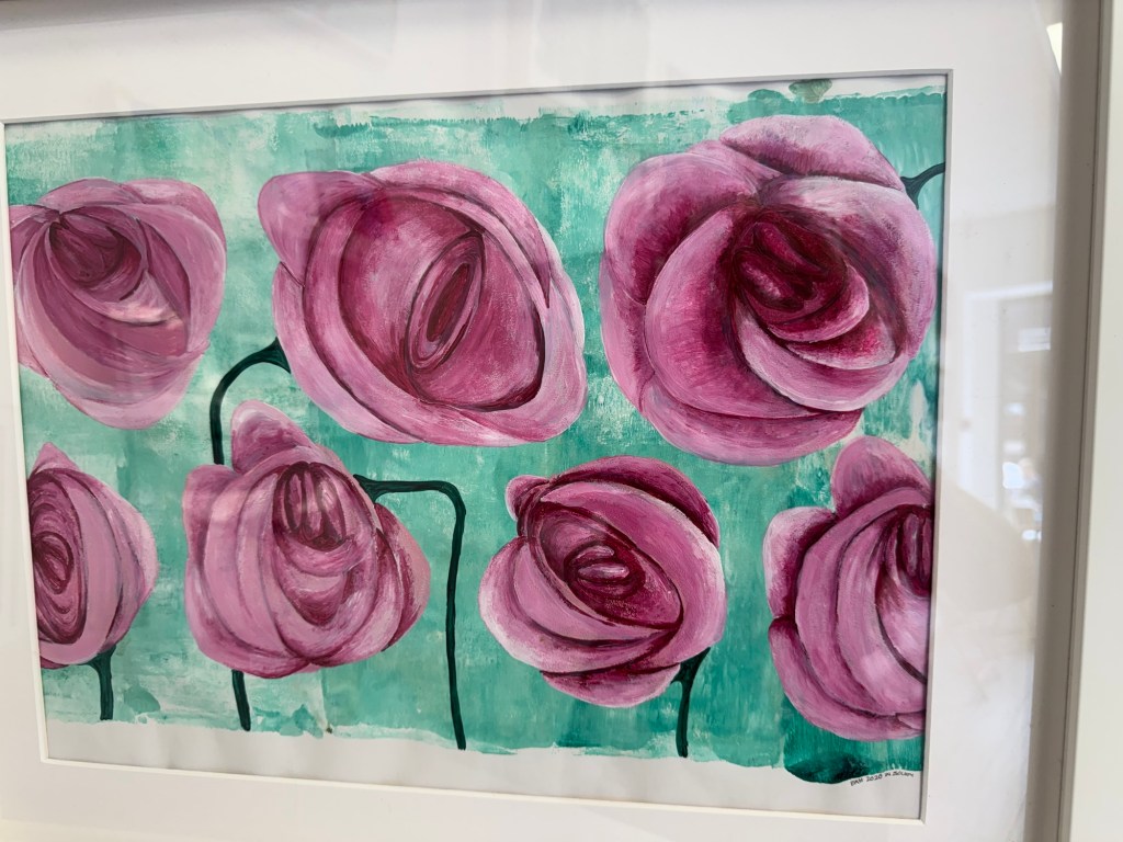
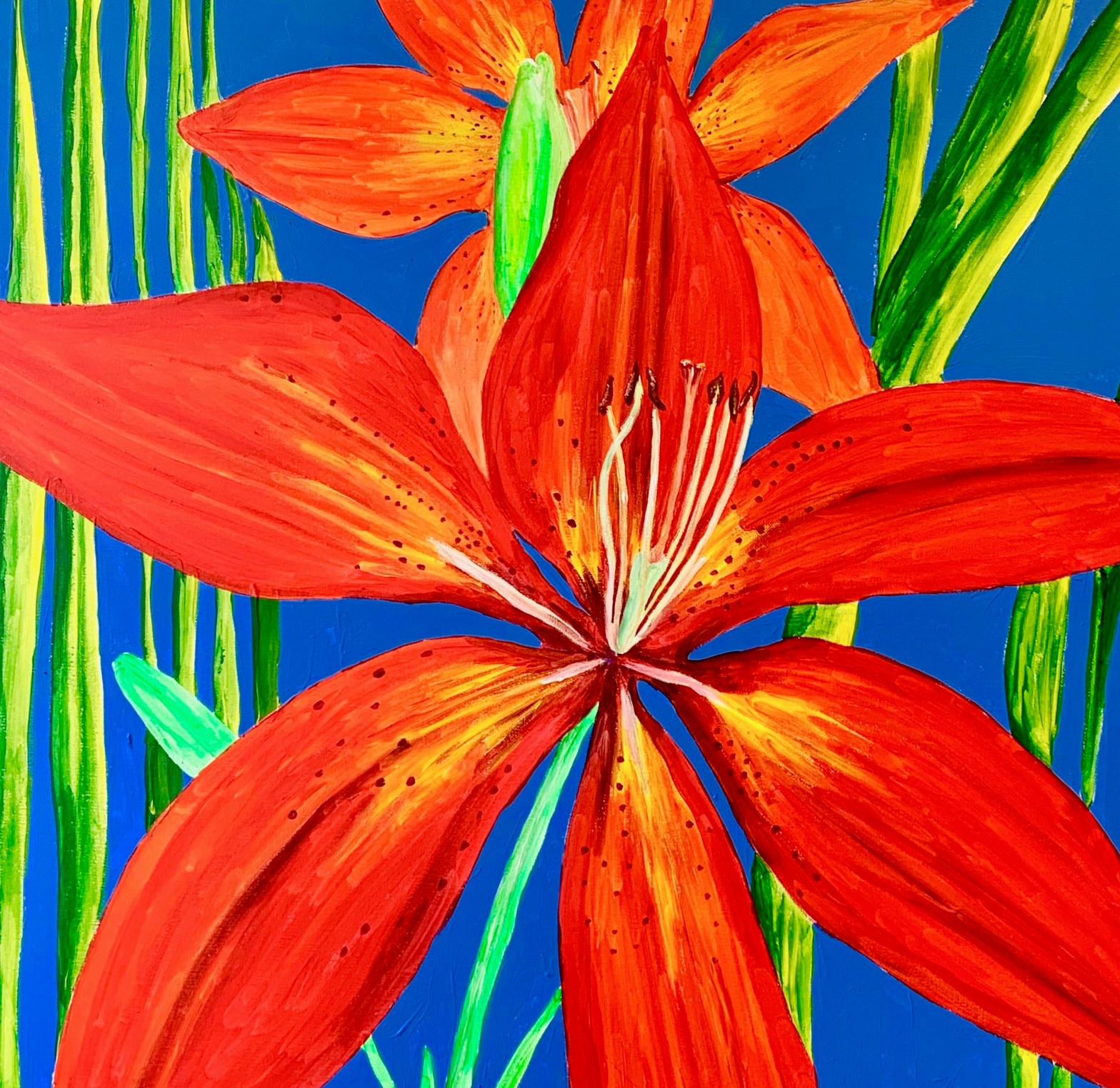
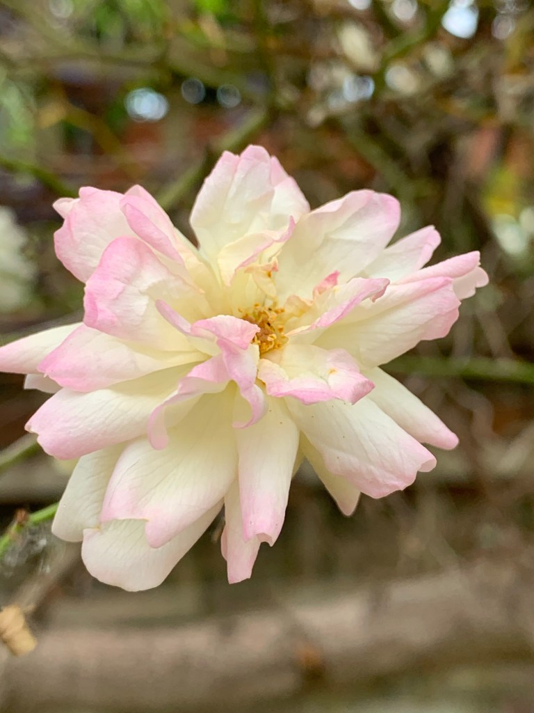
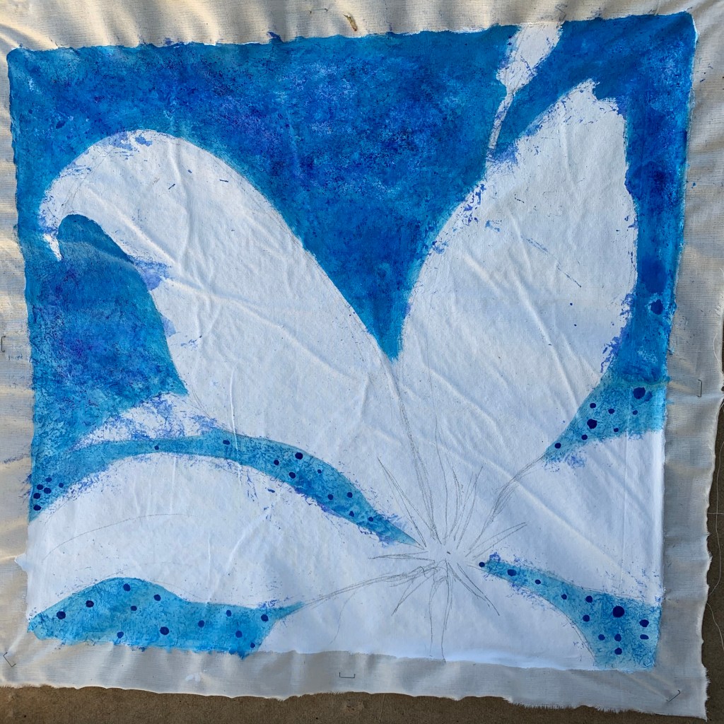
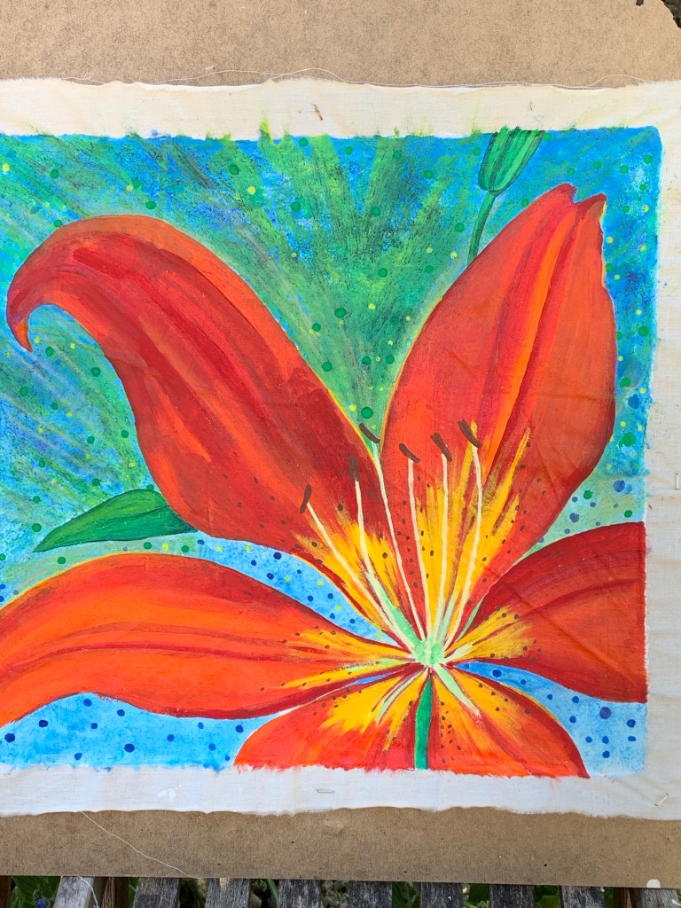
Glorious summer arrived in the garden this week, adding the rich, flame red of the asiatic lilies to the myriad of foliage greens, pale baby pink, yellow and peach of the various rose bushes.
Canvas
Out came the paints and a large, canvas square in the hopes of capturing the vibrancy of colour and the structural beauty of the fiery lily bloom. Matching nature’s colours is the artist’s tricky task when deciding to capture the variety of flowers in the garden and it was no surprise to discover just how many shades of red and orange were present on really close observation.
Creating the backdrop
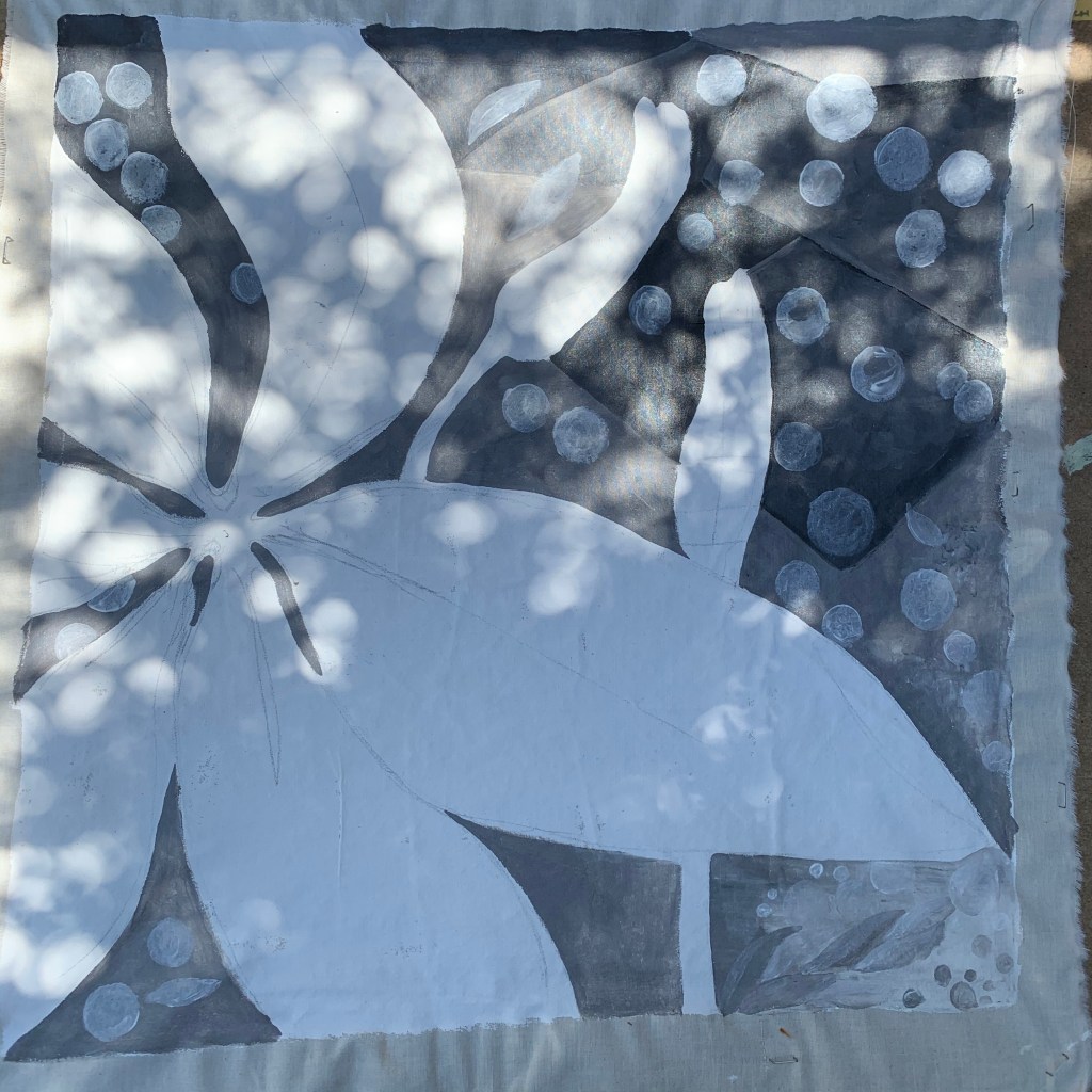
Despite the intense sun of the afternoon in the garden, a dappled light was falling through the trees above on the monochrome background – capturing the dabs of light created an unexpected interest in the background to the sketched out flower head. The decision to create two canvases in contrasting ‘settings’ emerged…I felt the need to paint one in the ‘usual’ setting – against the heat and intensity of the summer sky, but the other had to be set against a colour-drained, light-dappled, somewhat surreal background which kind of reflected my afternoon isolation mood. Drained.
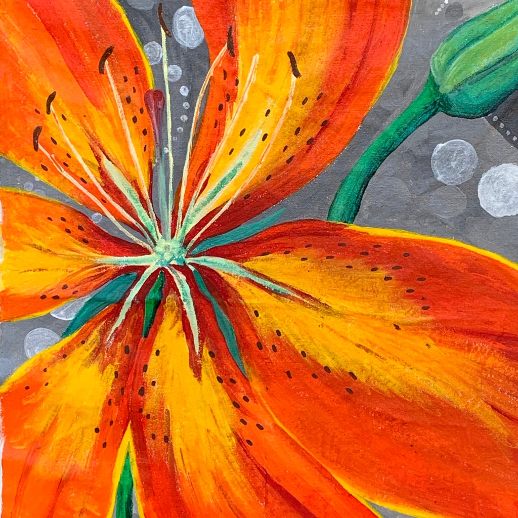
Hot Orange and flaming reds
Working from the centre of this structurally incredible flower head, the open petals display their intense, insect-attracting beauty mixing bright cadmium yellow strokes over crimson, vermillion and scarlet tones for such dramatic effect…
Completed colour creations
Lily, head in summer.Lily, head in isolation.
Why the mood change? Is it safe?
Wondering where this is leading, where my mood is going… isolation began in the spring as the garden filled with green serenity and a strange calm spread over our world. We stopped. We sat. We reflected. I painted my strange new world, my sanctuary and I was content. Two and a half months later, with a horrific numbers of deaths, this virus is still spreading through our land yet we are told ‘lockdown can be eased’. Our beloved south-west that we protected by obeying the rules, is now invaded by idiots who cannot see their folly, who troop to our beaches and contaminate our beautiful counties with their selfish desires. I now sit in my isolation, more worried than ever for my health, for my family and my neighbours. Despite the glorious colours of summer, a grey gloom hovers around my mood. I busy myself with community projects, helping others, filling my days with art, colour and try desperately to remain positive. We will beat this. We will survive because we followed the rules. Yet each weekend I dread the influx of those who will those infiltrate our south-west sanctuary. I selfishly say to those who bring with them the modern day ‘peste’, please stay away. Please leave us be and we might have a fighting chance of retaining our health. Please…
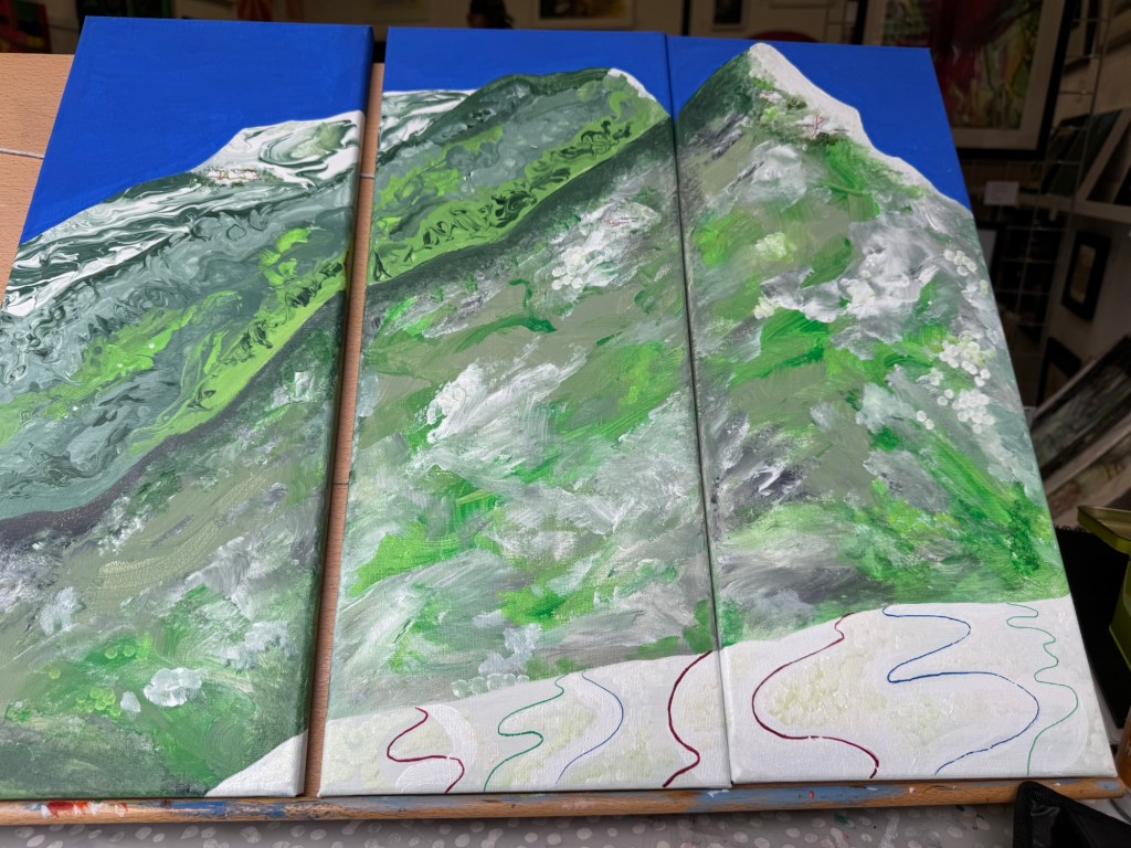
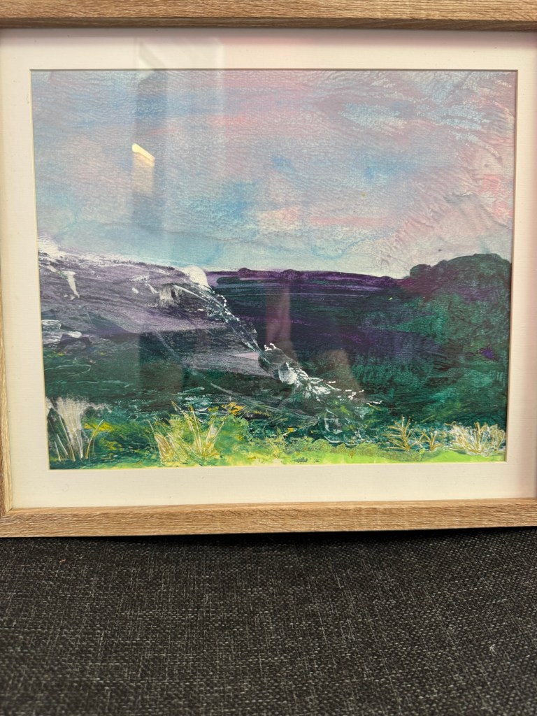
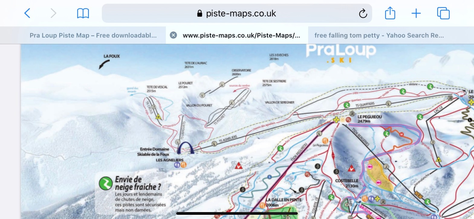
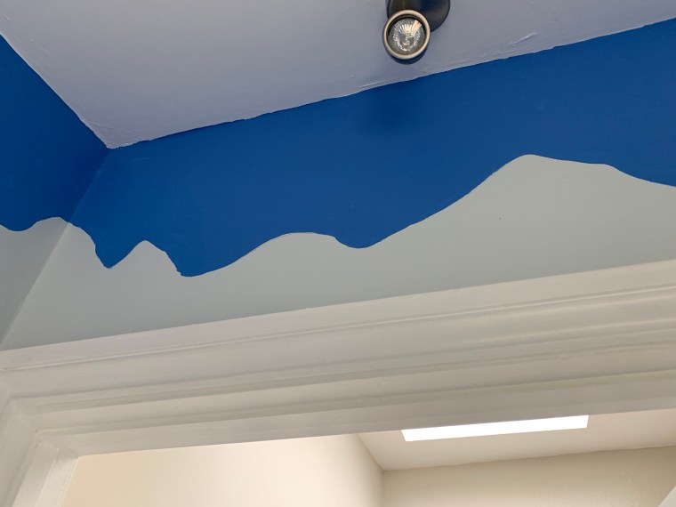
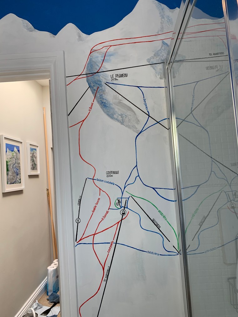
When I first decided to transform our downstairs shower room into a ‘homage’ to our favourite ski resort, I thought vivid blue sky and white mountains and a few ‘runs’, but like the best laid plans….it got a bit out of hand!
Background Painting
Then exact colour of blue had to match perfectly the image in my mind’s eye from March in the mountains…
Pra Loup Blue Skies…
…and so working from the reference of the piste-map, the colour went onto the walls leaving the shape of the mountains to appear in snowy silhouette…
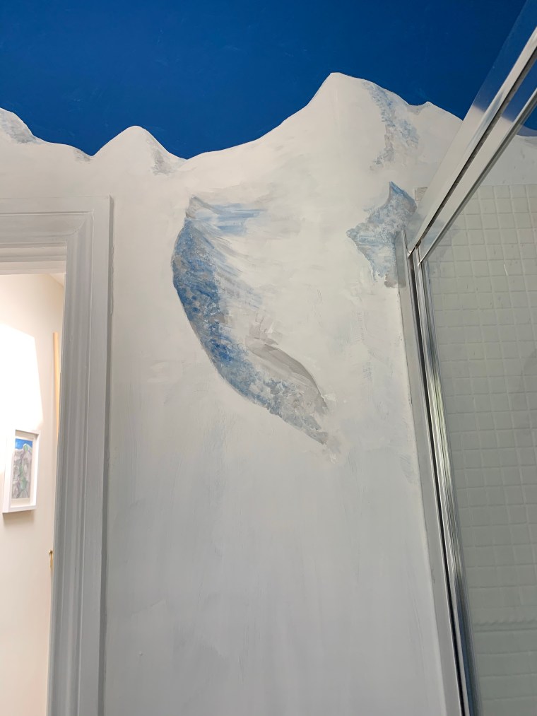
Creating the sense of place
The sky created the outline of the mountains and then the contours, ridges, and profile of the landscape was added using chalk paint, acrylic and emulsion paints…it is important that though an artistic representation, it is reasonably accurate…
Further shading and peaks are added to recreate the sense of place – Pra Loup, les Alpes des Hautes Provence…
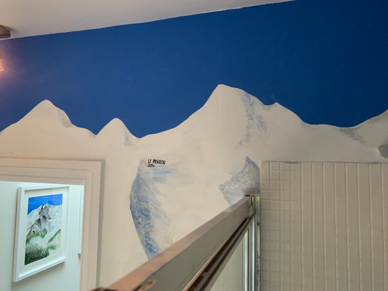
Lettering
Lettering and runs are then added to the walls, labelling each and every run and lift to recreate the piste map in a lot more detail that was actually first envisaged….
It’s hard painting and creating the piste map on the walls, its not perfect, but its a perfect reminder of our other ‘happy place’…and whilst it’s still not quite complete, but will be our very special little bit of Les Alpes des Hautes Provence, in Somerset!